

Hot Light, Cool Shadows
Color perception across levels of analysis

This is a kind of worked example of the level of analysis of the previous post applied to human color vision.
On the intentional level, seeing feels effortless. It feels like we perceive the world as it is. We see colors because things are colored. Some colors feel warm, others cool; an impression that seems shared by everyone. We also find some colors more pleasing which seems more personal.
Painters, architects, advertisers, and interior designers operate at this level, drawing on these shared impressions. They know that warm palettes energize and invite, while cool palettes calm and soothe. This intentional knowledge is not unscientific. At this level, research first aims to establish associations between perceived warmth and brightness, hue, and chroma across individuals. It then examines the various consequences these associations can have such as effects of color on mood, color and heart rate, color and blood pressure, color and skin temperature, color and touch, color and thermal perception, color and general perception of atmosphere and color and clothing behavior.
Although it may sometimes seem like a fishing expedition, and it can be, mapping these effects can provide direct, actionable feedback by answering questions such as Which app color scheme maximizes click rates? Can I sleep better with blue wallpaper than orange?
But mere observation without explanation yields only catalogued phenomena, not understanding. Results become isolated facts, hard to generalize, and predictions almost impossible, which therefore spawns ever more empirical studies. To break this cycle, one might be tempted to look at the implementational level of vision.
Cone Computations
The goal of visual neuroscience is to determine how information is organized and represented at each level of the visual system to produce our perception of the world. – Godat et al. (2024)
The general mechanistic idea of vision, following the efficient coding hypothesis, is that we have about 100 million photoreceptors, 4 million of which are cones for color. Yet only about 1 million neurons carry this information to the brain, implying massive compression. Importantly, compression here is not intended for a pixel-by-pixel reconstruction after transmission like we do with video files. There is no internal observer in the brain to view such reconstitutions.
These signals are then distributed to hundreds of downstream neurons each to extract and represent relevant patterns to guide our actions. Vision is less about preserving images than about interpreting signals efficiently under severe biological constraints. In fact for every neurone transmitting visual information toward the brain, ten neurones are transmitting information from the brain to guide our vision.
Human color vision begins with three classes of cones sensitive to either long (L), medium (M), and short (S) wavelength. They roughly correspond to red, green, and blue receptors1 (Figure A). Since each cone responds to a range of wavelengths, any individual cone type cannot detect color on its own. That is, S cones cannot distinguish between a change in wavelength from 450nm to 400nm (which would increase the signal) to a change in intensity of a constant 450nm light (which would also increase the signal).
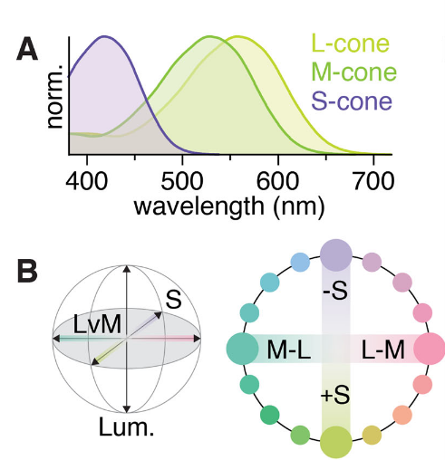
Stable hue perception thus emerges only through comparisons among the three cone types. Early in the visual pathway, these signals are recombined into opponent channels (Figure B). L versus M for red versus green, S versus (L+M) for blue versus yellow, and L+M for luminance2. We can call this wheel the color space. At this stage, there is no “red” or “blue” impression, only patterns of neural activity, part of the information compression from individual cone to hues. Beyond early visual areas, color information becomes increasingly distributed and intertwined with shape, illumination and memory.
Color processing clearly continues; we just don’t know exactly how it is implemented. For example the sensitivity is adapted to maintain stable perception. If green dominates the scene, the gain on green signals is reduced to prevent saturation and preserve the ability to detect hue differences. Luminance is also interpreted relative to surrounding light. As Pinker’s example illustrates in How the Mind Works, a piece of coal appears black both in sunlight outside and in dim indoor light. Similarly, snow appears white in both conditions. Yet you would measure more light bouncing off the coal outside than off the snow inside. This general phenomenon can be referred to as color constancy. Color constancy makes you able to see grapes as green and oranges as orange under different lights in the image below. In reality, the color of the grape in the left photograph is the same as the color of the orange in the right photograph.
In my last post I highlighted that mechanistic explanations can be sufficient when explaining anomalies (at the risk of misrepresenting fuse-like problems). We find the same pattern here, with color blindness explained by the early processing of cone receptors. When one cone type is damaged then either the red-green or blue-yellow dimension partially collapses. You can still form a color experience, but one of the directions in the color space is flattened and a range of light that differ physically can end up triggering the same response.
But understanding how the mechanism breaks down only tells half the story. Why would we prefer some wavelength inputs over other? why would we feel differently about warm and cool hues? To grasp why the system is wired this way in the first place, we must shift from the ‘how’ to the ‘why’ by moving from a mechanistic view to a functional analysis.
Color as a Compass
Functionally, vision processes inputs to produce outputs. Outputs might not be image so much as information to navigate the physical and social environment. This includes motion detection, object recognition, landmark identification, face and emotion reading. More than just informing, the outputs should help us direct our attention and make decisions.
To illustrate, the usefulness of visible landmarks for orientation purposes could drive the aesthetically pleasing aspects of mountains or other striking formations in landscapes.
In face recognition, we not only recognize faces and expressions, we also attend to face-like patterns more readily than to other stimuli, possibly even before being born, and we directly connect faces with our feelings and past experiences of that person. Capgras syndrome illustrates this second aspect vividly. People afflicted by this syndrome think of their relatives as impostors. They can recognize a familiar face but fail to link it to the feelings and memories normally associated with that person. Let me just restate that. A person with Capgras syndrome can identify with perfect visual acuity a close relative, recognize all the similarity, yet fails to recognize him. This extreme case highlights how our perception of the world is not just about raw signals but how those signals are integrated into feelings and sensations. So, what about colors? Let’s do the functional analysis by the book.
1. What’s the problem, sir? (Evolutionary complaints only)
As already mentioned, humans faced the challenge of navigating complex, information-rich environments. Among a flood of data, the visual system must satisfy the dual needs of making precise discriminations, like choosing the edible berries from their poisonous cousin, and fast appraisal in time-sensitive situations, like when a predator is coming your way. Solving these problems required detecting regularities in the environment to simplify appraisal, attributing emotional valence to guide adaptive behavior and supporting accurate memorization for learning.
2. The Brain Assembly Guide
Color perception allows us to differentiate relevant objects more effectively.
Like poisonous berries from blueberries and ripe fruits from rotten ones.
The visual system uses colors as categorical cues to reduce complexity in object recognition.
If it is green, it is most likely a plant. If you have never seen this type of plant before you can infer properties from plants you know.
Color cues build from reliable environmental associations.
The sky is always blue3. So blue is likely to make you think of the sky or ocean.
Remembering is improved because of the reduced complexity of color categorization.
You can’t remember the exact value but you remember you were in the red.
Colors are associated with emotional values to guide behavior.
If it looks good, maybe try to eat it. If it looks like shit, don’t.
3. Did it follow the instruction? Or are there loose screws?
From the annual review of vision science we can say that color vision helps us discriminate objects more effectively in a natural setting. Even going from dichromatic to trichromatic vision helps identify ripe from unripe fruit from a few meters away.
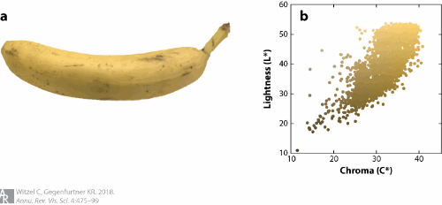
We also find that colors are used to categorize objects. Objects that have a reliable association with a color form a “memory color”. The memory color of a banana is yellow. Memory colors come from reliable environmental signals and do not appear for object that have no strong color association. Memory colors are strong enough that even a gray image of banana is seen as a slightly yellow color. This is a measurable perceptual effect that can also be observed with evidence of brain activity in regions specific to the perception of colors. More than just helping categorization we see that perception is a blend of external light and internal memory, physically “recoloring” the world to match our expectations.
To examine the role of color in memorization, this study exposed participants to landscape images presented in either their original color or in reduced level of contrast down to black and white, before testing their recognition of the image. They found that recognition was better when the original color was preserved, compared with when the color was removed. Similar results were found here and here with improvement in the range from 5% to 10%.
However, this latter study unveils a catch: the recollection improvements only appear if the colors make sense. In their experiments, an artificially colored landscape does not help any more than a black and white image. This suggests that our memory doesn’t just use the additional color information for memorization directly. It uses learned color associations from our daily lives to shape categories which then serve classification and memorization.
As expected, then memory color helps object recognition provided the objects are in their natural or usual color. Color neutral objects show no effect.
Already the color association, memorization and discrimination provide useful predictive tool to navigate our environment. Guiding our behavior however should imply some feelings.
The Ecological Valence Theory (EVT), proposed by Stephen Palmer and Karen Schloss, suggests that people’s affective responses to certain colors come from the objects or events associated with those colors. Color preferences arise from people’s average affective responses to color-associated objects. So blue is generally appreciated because the sky and ocean are nice. But dark brown is not appreciated because it literally looks like feces.
They first evaluated people’s preferences (C on the graph below) with respect to different shades shown in A. You can forget B for now. This first step already highlight some consistency in people judgement about color preference.
To explain the cause of those preferences they used a color-connotation value called WAVE (Weighted Affective Valence Estimate). To calculate WAVE, people first listed objects brought to mind when seeing each color4, other participants then rate those objects as generally positive or negative (valence), and a third group rates how well each object matches the color. For each color WAVE is calculated as the average positive ratings of the color-associated objects weighted by the strength of the color–object match. Using this method, they explain an impressive 80% of the variance in color preference as shown in C.
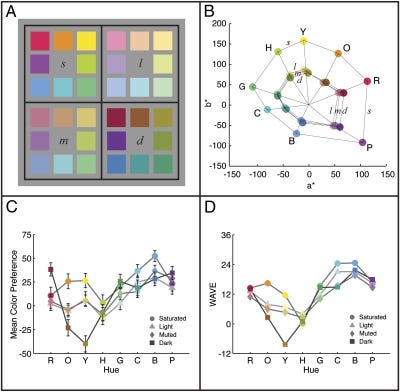
On a careful note, the results are less impressive in repeated studies. In a Saudi Arabian sample, WAVE accounted for about half the variance in color preference. Still, it provides a solid explanation for what is most likely a small effect to detect5 with multiple contributing factors.
One color association however is very robust, that of warm vs cool color. According to this paper warm vs cool colors form a remarkably salient psychological distinction across cultures and languages. This divide appears early and consistently, suggesting it is fundamental rather than arbitrary. Apparently, some languages divide the entire color space using only two basic terms, roughly corresponding to warm vs cool.
[…] warm and cool colors may reflect two largely complementary yet independent categories. But what do these categories represent? - Manalansan et al. (2025)
The researchers initially sought to ground the familiar experience of warm versus cool colors in established models of color perception. They examined whether this subjective division aligned with the well-known opponent color axes of red versus green and blue versus yellow I mentioned above. It didn’t. But neural intensity doesn’t necessarily translate to perceptual intensity. A strong neuronal input signal doesn’t guarantee a strong sensation. So, the researchers remapped their colors into a framework designed to predict how saturated or vivid colors actually appear to us.
They revealed a paradox. In general, the warm and cool regions were the dullest, least saturated hues. Meanwhile, the boundaries between warm and cool (purplish and greenish regions) were the most vivid and intense. It seems counterintuitive then that the psychologically salient distinction is between warm and cool light instead of green and purple.
The researchers then explore several hypotheses linking warm-cool perception to color naming patterns, scene statistics, and neural mechanisms. While these observations are valuable, I think they approach the question backward. They look for why we would have evolutionarily reduced our sensitivity to important signals, rather than look for why these particular signals would be important in the first place.
When investigating this second question instead, the most convincing answer6 comes from the observations of Keith Enevoldsen’s in his blog. His theory focuses on the only natural light source we have, the sun. Its initially white light reaches us in two ways:
Direct sunlight, filtered by the atmosphere, loses much of its blue content, producing yellow-to-red light depending on the sun’s position.
Skylight, the scattered blue component, diffusing from the sky.
This creates a fundamental environmental duality, surfaces struck by direct sunlight are warm and illuminated with high-luminance yellow-orange hues. Surfaces in the shadows are cool and illuminated in low-luminance bluish hues. This is a permanent feature of our existence. Ecological valence theory applied to an association this reliable means that we don’t only see the colors, we feel them. The psychological importance arises from reliable cues and functional needs. And the implementation is built to fit the function.
Indeed, luminance is primarily computed from the red and yellow cones which amplifies the warm-cool distinction, making skylight appear dimmer than sunlight of the same physical intensity.
The previously puzzling finding that the warm-cool axis had lower saturation, now appears advantageous. Objects we need to attend to or identify are illuminated by either cool or warm light. We have seen that to maintain color constancy, the visual system must effectively discount illumination and focus on the underlying object “true color,” whether in sun or shade. Under this framework, we should expect saturation to be lowest along the cool–warm axis, and highest for the most behaviorally relevant colors in our environment like the green of vegetation. And indeed, we do7. Also aligned with this expectation is the finding that we are most able to maintain color consistency under bluish light which correspond to the lighting conditions of natural shadows in the environment.
4. Cultural and personal customization
If the design is universal, why do we disagree on the “best” colors?
The Ecological Valence Theory (EVT) suggests our preferences are based on associations from our personal experiences with colored objects. So variability is included. They tested this influence with students university colors. As it turns out students’ preference for their university’s colors increased with how strongly they identified with the school8 .
An exception is the warm and cool division. Sunlight and skylight are universal environmental references and produce consistent perception of warmth or coolness.
Another large source of variation is salience. That is, out of all the color-objects association you could think of, which ones come to mind in this moment? When driving, green means go and red means stop9. So, in this context probably green is what you prefer to see. When shopping maybe red fruit is what you prefer to see over green. Context brings salience so you can use categorical thinking effectively. This has also been highlighted by influencing salience in participants. When some participants were first exposed to negatively-associated green objects, their subsequent color ratings were lower for green colors.
It appears in fact that simple shape or colors act as an open learning system that support an improved and more explicit learning of new association than other senses like sounds. This effect is no longer true when color is integrated into a larger evolutionarily relevant stimuli like landscapes, human faces or cute animals. Those images seem to trigger strong preferences and indeed constitute most of online visual content and before that most of art creations.
5. So, how does it feel?
Color Constancy is remarkable because it completely ignores “objective” light. But we never notice it. Categorization as well. Keeping to the banana, in the image below you think of the banana as uniformly yellow. This is a very common lighting condition and yet you can see that there is nothing uniform in the color reflected from the banana. You can see the shading but your brain is essentially saying “Ignore the gray; that’s just the environment interfering with the object’s identity.” This is so automatic and so universal that it is hard to even think that anything special is happening or that we could see things another way.
For the emotional valence you would feel this most when imagining a warm firelight in a cold winter. Outside of this noticeable effect feeling about colors are muted compared to other senses10 . This makes sense as the same color can represent both “positive things” or “negative things”. What brings emotions are complex visual stimuli not single colors

Final bouquet
This post has the same takeaway as my last post: we often like to offer only one level of explanation and pretend it tells the whole story. It doesn’t. Correlations explain nothing (but might hint at useful effects), mechanisms can solve problems (or backfire spectacularly), but theory is the glue. It’s the thing that makes the other pieces feel like a story rather than a random assortment of facts. Is it always a true story? No.
Take the warm-versus-cool color theory I mentioned. Maybe someone somewhere is already disproving it or will do so in the future. But I find the structure it provides to the otherwise unorganized and disparate findings useful either way. People will always integrate elements into a coherent narrative even an implicit one. That all variation is cultural. That deviations from standards are ‘errors’ to fix and not adaptations of a complex system. Functional analysis makes the narrative explicit and connect the dots so we can notice the ones that fit in and those that stand out.
S cone can still influence perceived brightness/lightness indirectly, via contextual integration mechanisms. Basically, as “post processing” in later brain areas
Or grey but you get the idea
Except personal objects like your wallpaper or your favorite pair of socks
How much do people really care about abstract color rating?
Which prompted me to write this post. I have not seen it mentioned elsewhere despite its apparent simplicity.
Among the boundaries, the green one is higher saturation than the purple one
Unless they choose their universities because of the color preference which seem widely less probable
As in most contexts
Think about the ugliest color you ever saw. Now think the worst smell you ever encountered. See what I mean?